
ONLINE STORE DESIGN / LAB SERIES
Led UI redesign of online store for Lab Series ahead of transitioning to Shopify. Lab Series website design was in need of a branding refresh that elevated their aesthetic. Since they don’t have a design system, this was a fun opportunity to enhance certain elements, such as live chat iconography and establishing a theme to make their use of typography more consistent. Their live site currently had issues with type inconsistency, lack of branding through UI, accessibility issues with their content blocks, and not using established aspect ratios for their images. Their live site did not currently align with their brand presence, so we used the Shopify migration as an opportunity to elevate their brand presence and create a memorable and seamless customer experience.
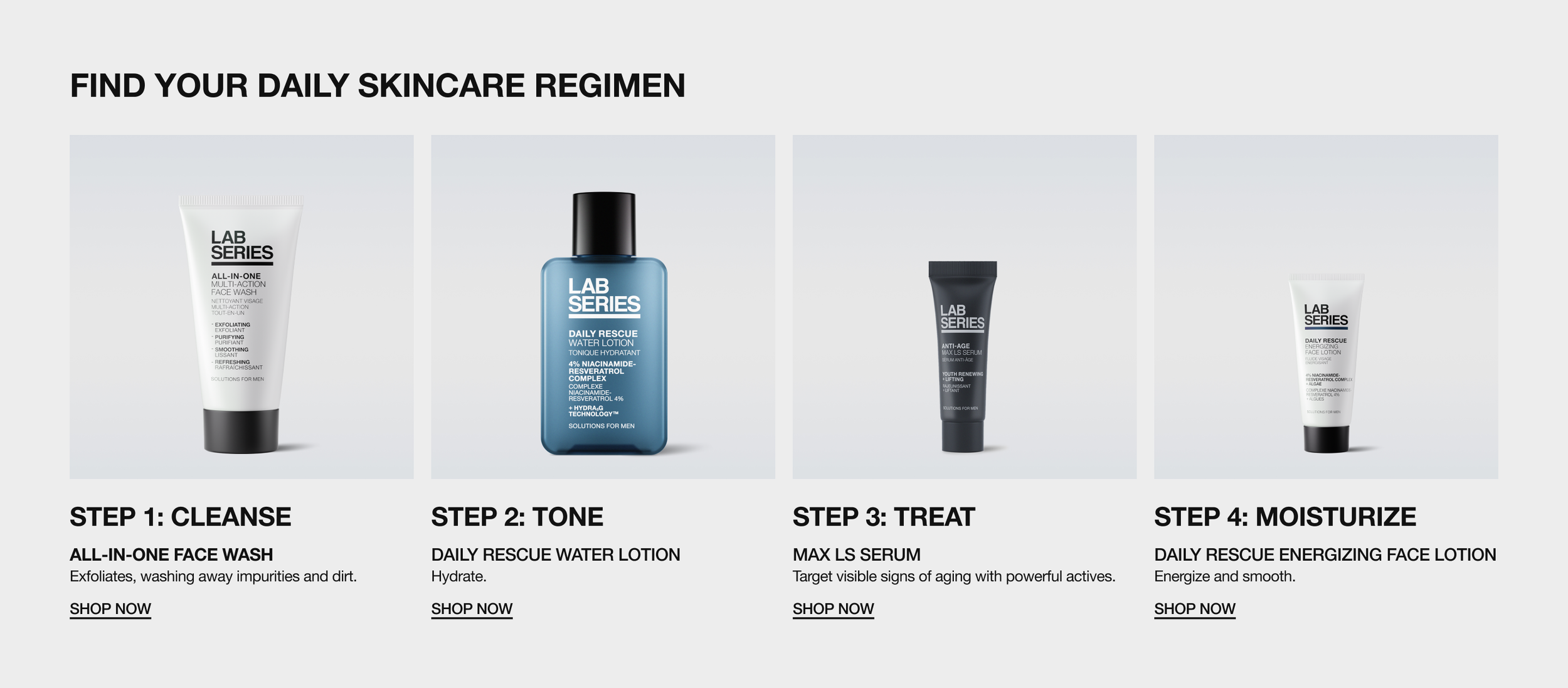
CONTENT BLOCKS
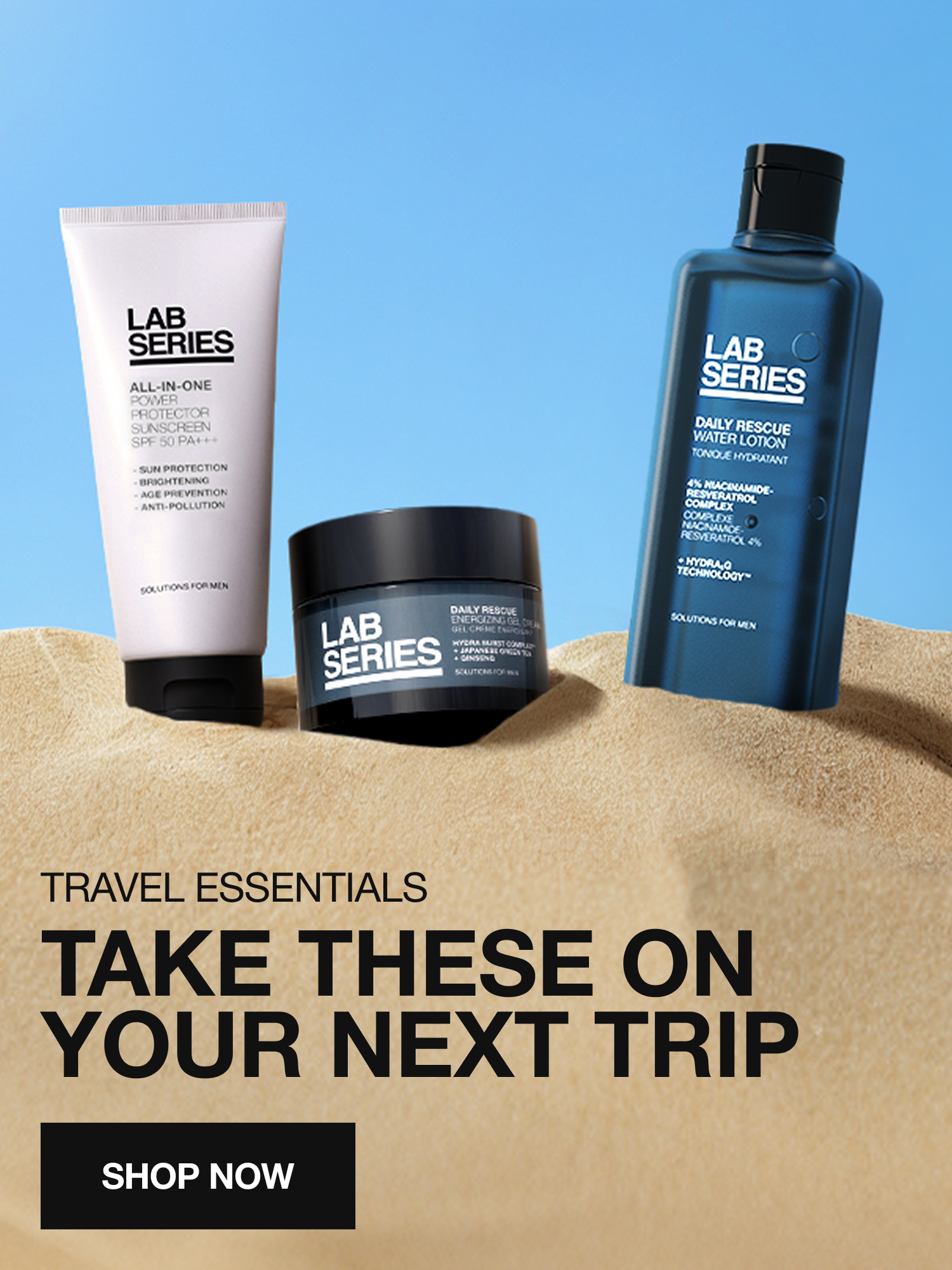
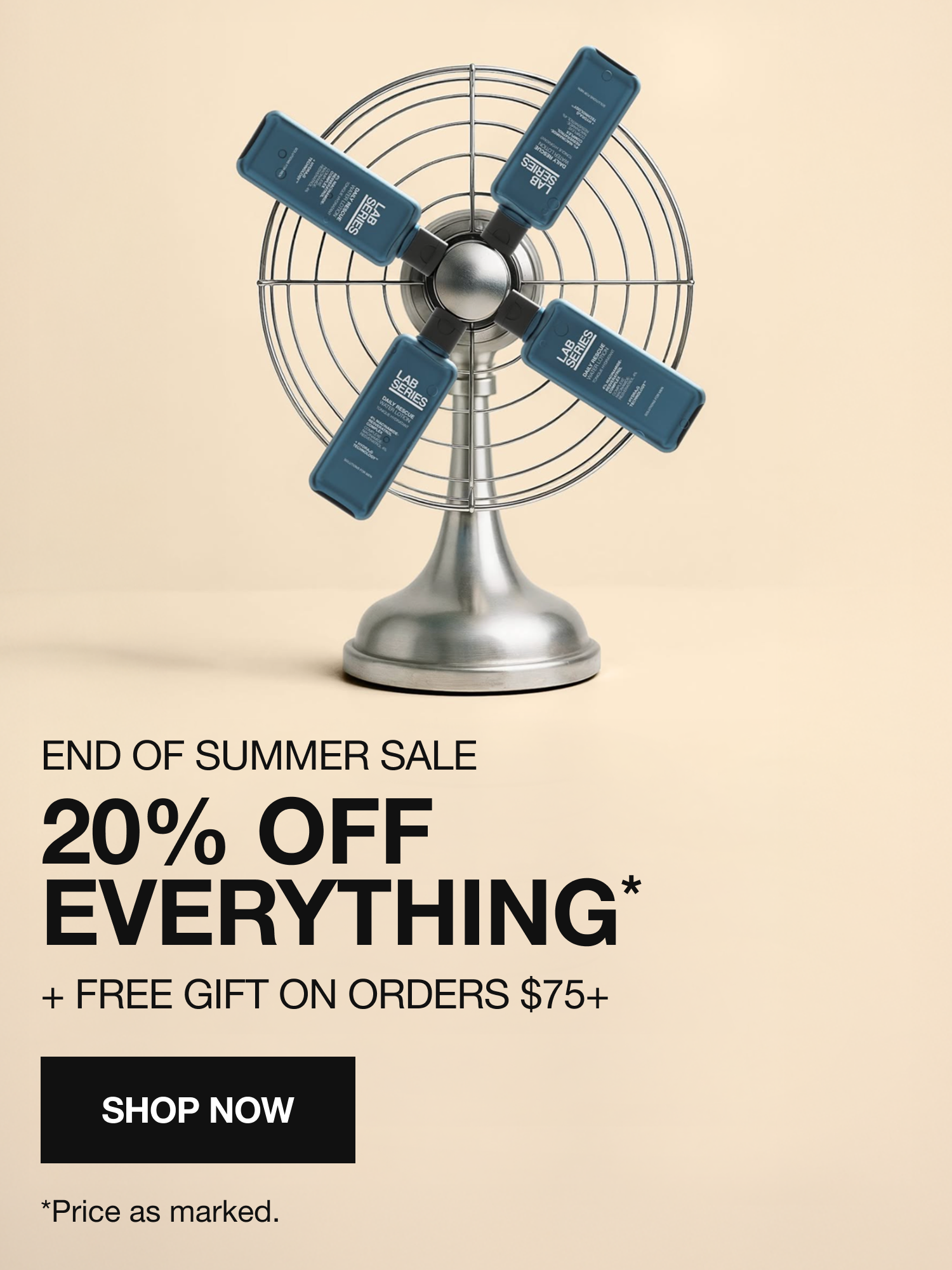
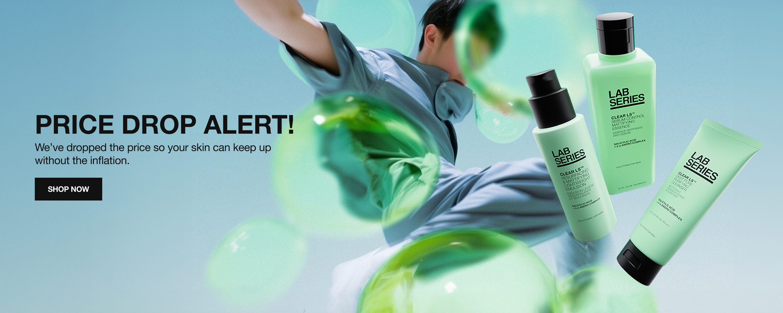
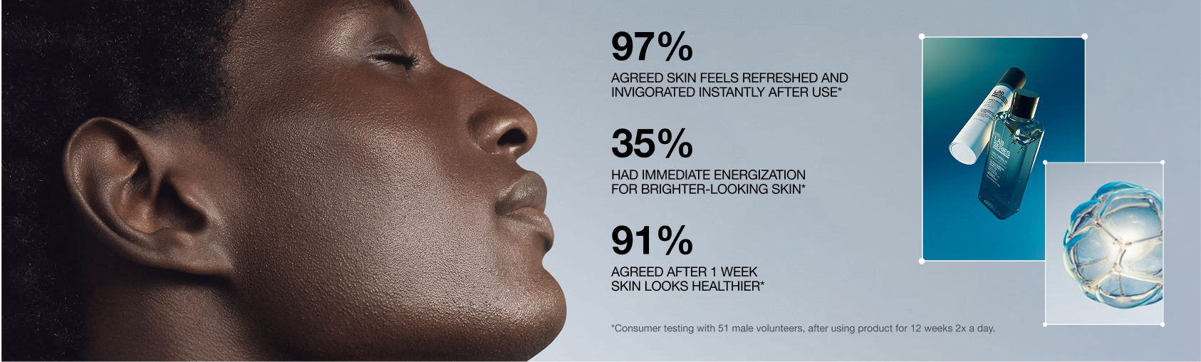
Exploration to demonstrate to the brand the capabilities of Shopify for their content blocks, how to utilize their assets to pass accessibility, and implementing cohesive typography and button sizing across all.
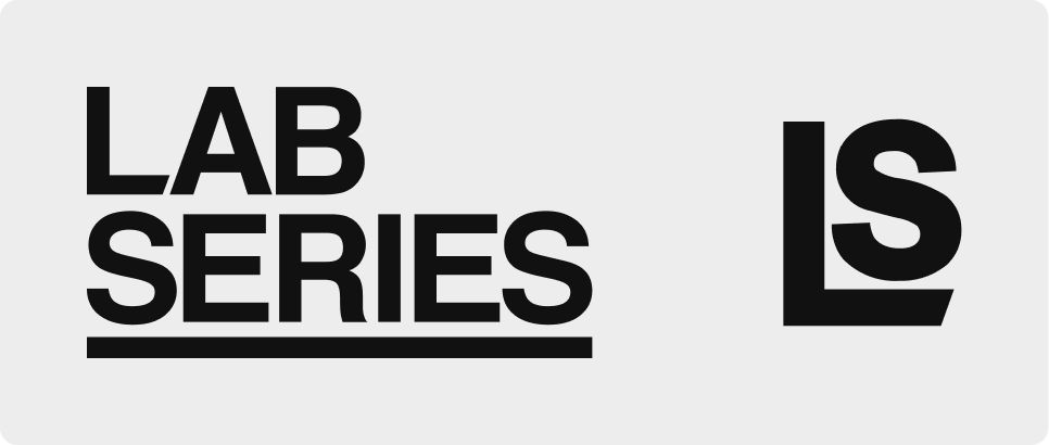
EXISTING BRAND ELEMENTS
Since there is no existing Design System or formal style guide for Lab Series, I took inspiration from their existing logo and favicon to utilize throughout the site UI:
• Angular end of the L letter in logo and favicon
• Sharp corners
• Thick, heavy line strokes
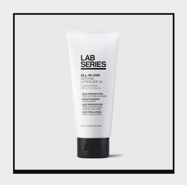
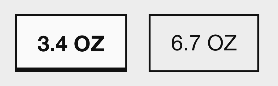
EXAMPLES OF UI ELEMENTS UTILIZING THIS
• Size Chips or Thumbnail Selectors
• Sharp corner radiuses for CTAs, Dropdowns, Checkboxes
• Tight spacing and thick strokes for hover states in GNAV/Footer, as well links
• Diagonal slashes for dividers between text to mimic angular L of logo, such as breadcrumbs and price/PPU
REDESIGN OF LIVE CHAT ICON
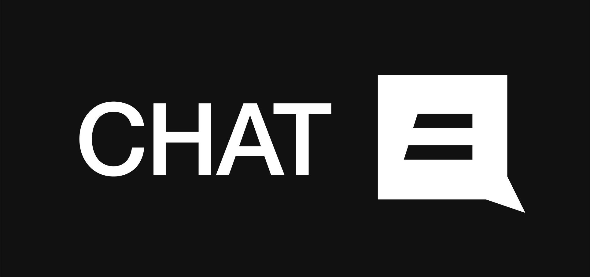
Lab Series current chat icon was off brand with the color, font, iconography, and corner radius. Taking inspiration from the bottom line of the L and the angularity, I created a new live chat icon consistent with their branding. I also explored different options using the same inspiration as a base mentioned above.
Old Design

Final Design
Other Explorations

PLP DESIGN
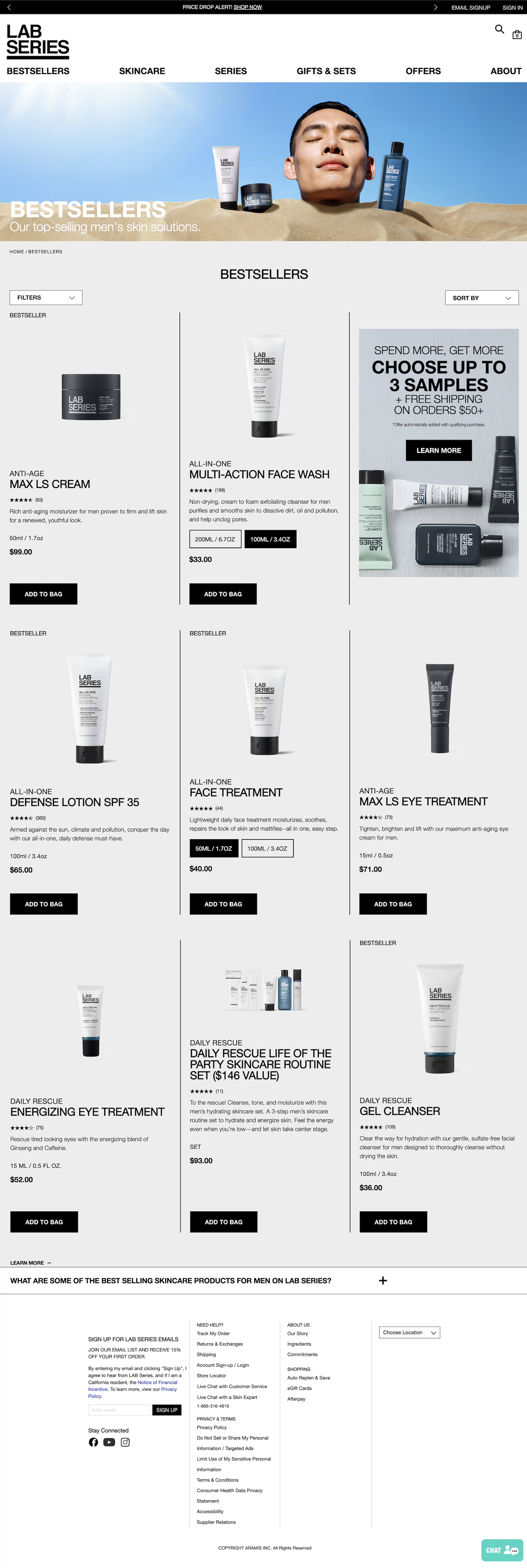
PREVIOUS PLP DESIGN
PREVIOUS DESIGN ISSUES
• Alignment issues – Icons in GNAV, Product Card title and images are misaligned. Because of these alignment issues, in addition to products having the same background color of the page, the vertical stroke dividers feel cluttered, but without them, everything would look randomly placed on the page with no way to make sense of a grid.
• Accessibility issues with PLP hero. Content is also not evergreen and is still currently on their live site. This asset is better utilized as shown through content blocks above, with messaging relating to a Summer Sale or travel getaways.
• Size chip color competes with the CTA.
• Hierarchy issues – FAQ “Learn More” as well as the footer.
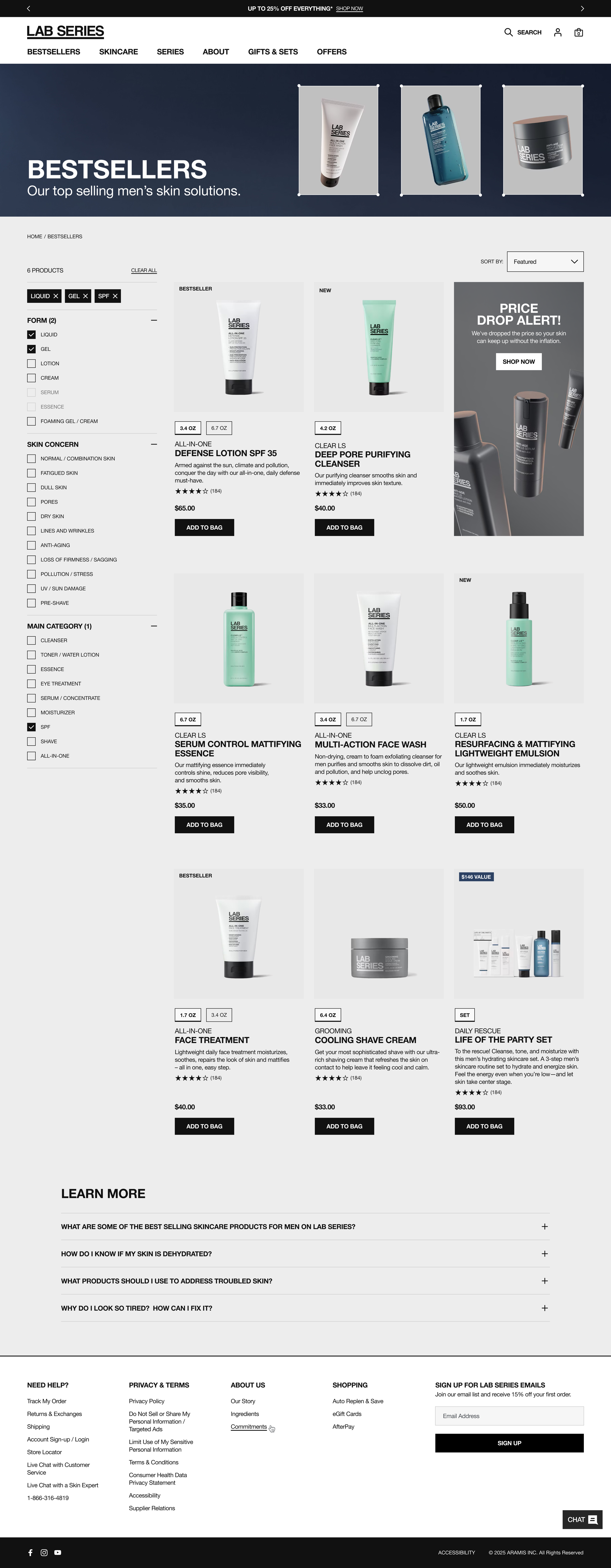
NEW PLP DESIGN
NEW DESIGN SOLUTIONS
• Fixed alignment issues throughout – now product card title, images and CTAs are all aligned.
• Removed strokes and added in product image background color different from page background, which further helps users easily scan through products.
• Added in exposed filter menu on desktop to further help customers navigate to find the product that fits their needs.
• Use of horizontal logo in GNAV for less space (and because Shopify can only support one logo version, stacked doesn’t work on mobile). GNAV spacing now optimized for addition of new categories, especially relevant during holiday or specific sale items that are not sitewide.
• PLP main hero banner shows evergreen content with correct aspect ratios. Text is now accessible / easily legible.
• UI elements are now uniquely tailored to the brand. The size chip treatment stands out without competing with CTA. Added similar treatment of heavy strokes to the footer, along with the updated chat icon.
• PLP touts now match max height of product card rows, creating more visual consistency with product grid.
• Added badge to PDP image for value sets instead of placing it in the title.
• Hierarchy issues resolved for FAQ and footer.
PDP DESIGN
PREVIOUS PDP DESIGN
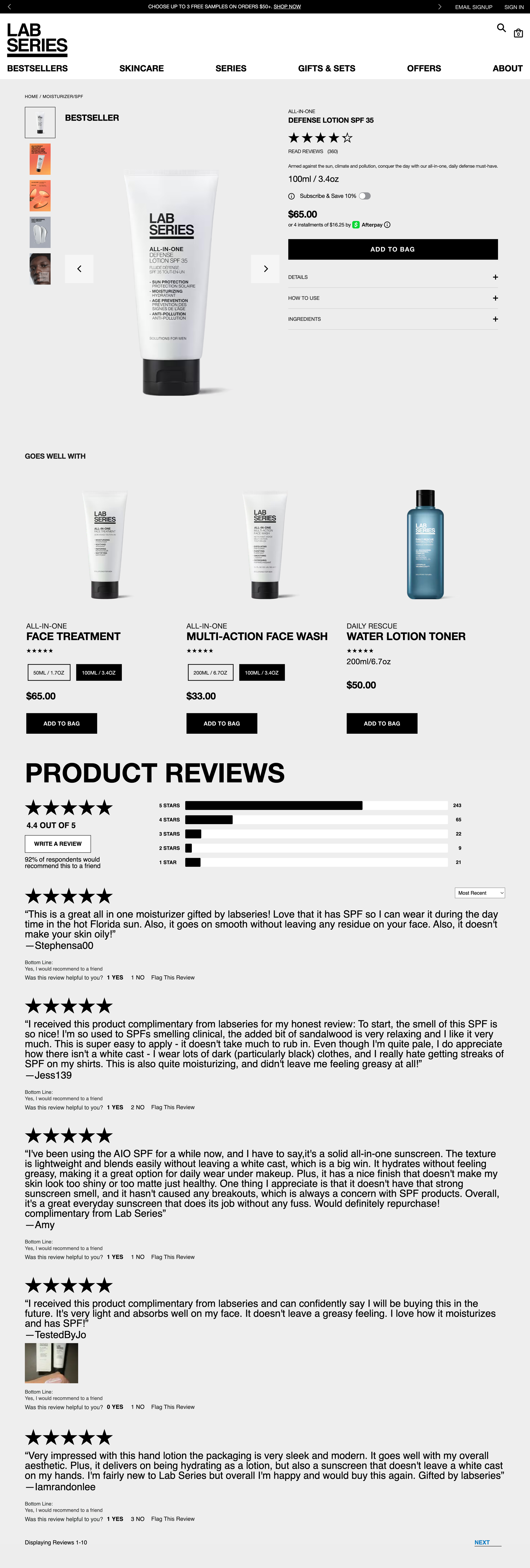
PREVIOUS DESIGN ISSUES
• Typography inconsistencies across all elements and creates confusing hierarchy of information, and feels cluttered and disorganized:
• PLP and PDP product titles had different font treatments.
• Font sizing hierarchy was all over the place and reversed – too large for instances such as product reviews, “Bestseller” badge, and product size, but too small for product title.
• Image ratio of product images was not a proportionate ratio, and the vertical sizing pushed product too far down the page. Also inconsistent with the 1:1 ratio of the selected thumbnail image.
NEW PDP DESIGN
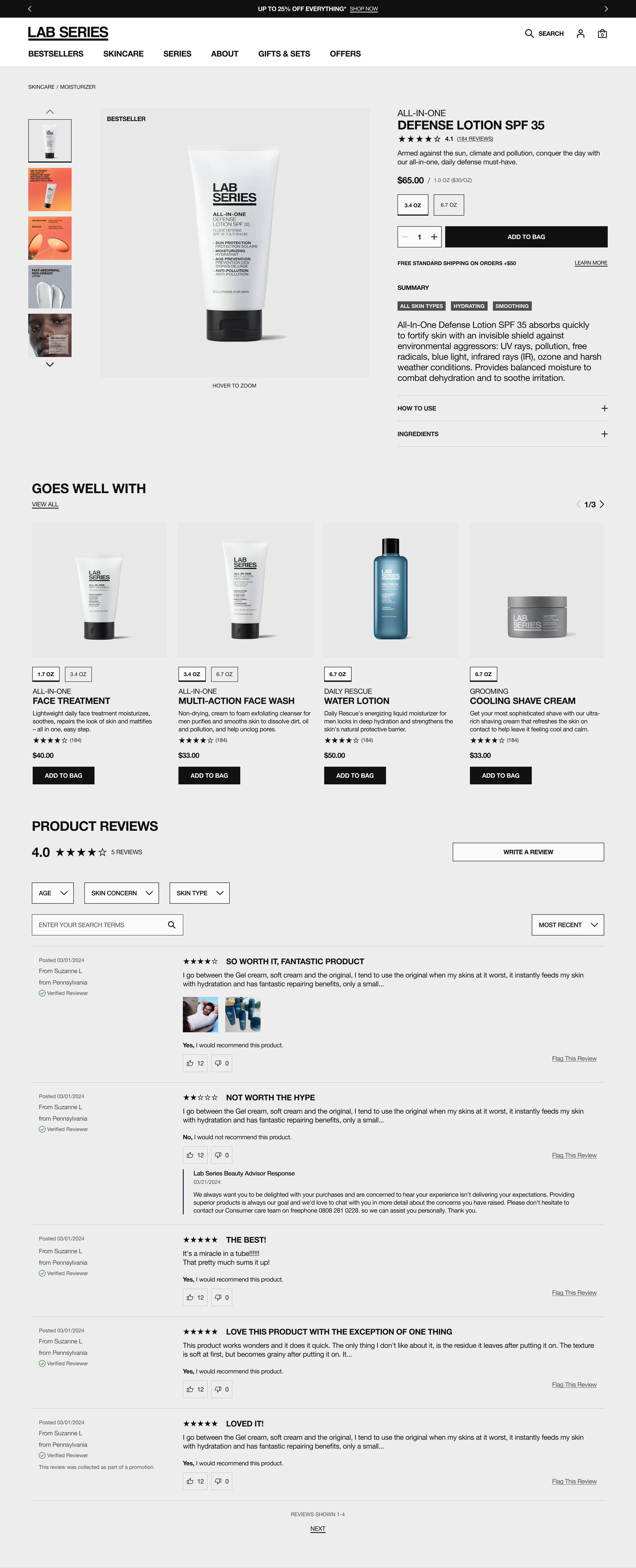
NEW DESIGN SOLUTIONS
• Created consistency between typography so the information is clear and easy to understand. PLP and PDP product title treatments now match, creating consistencies across the site.
• Added same treatment of size chips to the selected thumbnail to increase branding.
• Links, as shown in the promotional messaging below CTA or in reviews, shows heavier weight of stroke to match their branding and GNAV.
• Now have larger highlighted “Summary” section outside of the accordion that is always exposed.
• Addition of CVL badges to further highlight product benefits.