PDP EXPLORATION & CONCEPTING / ESTÉE LAUDER & M•A•C
CONCEPT 1
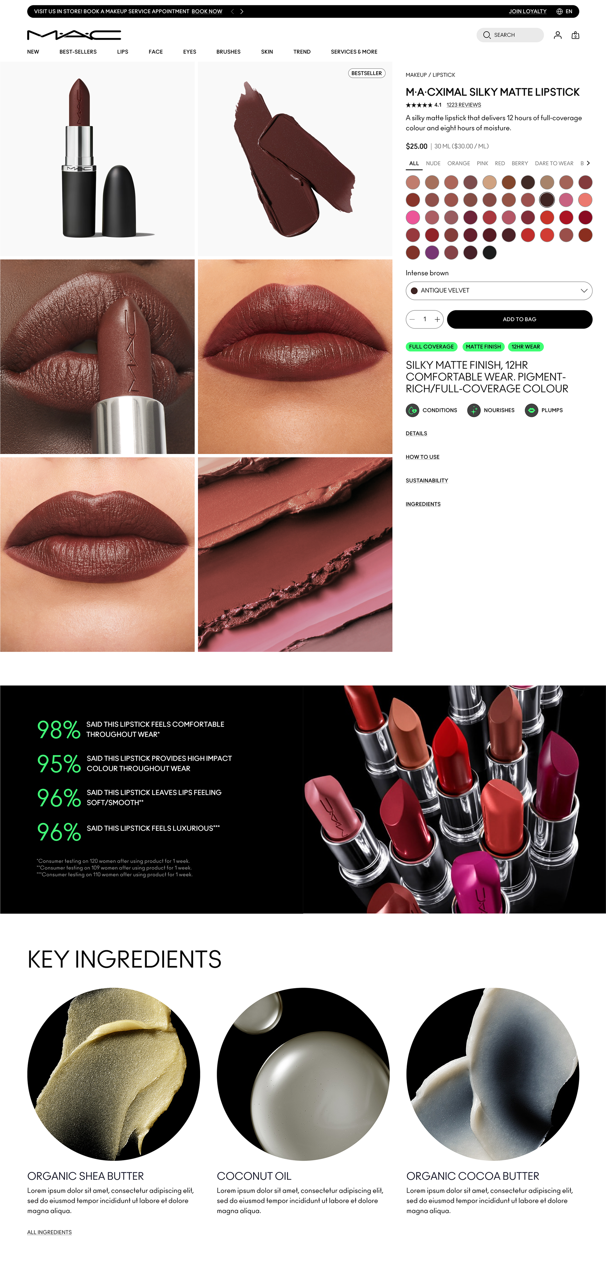
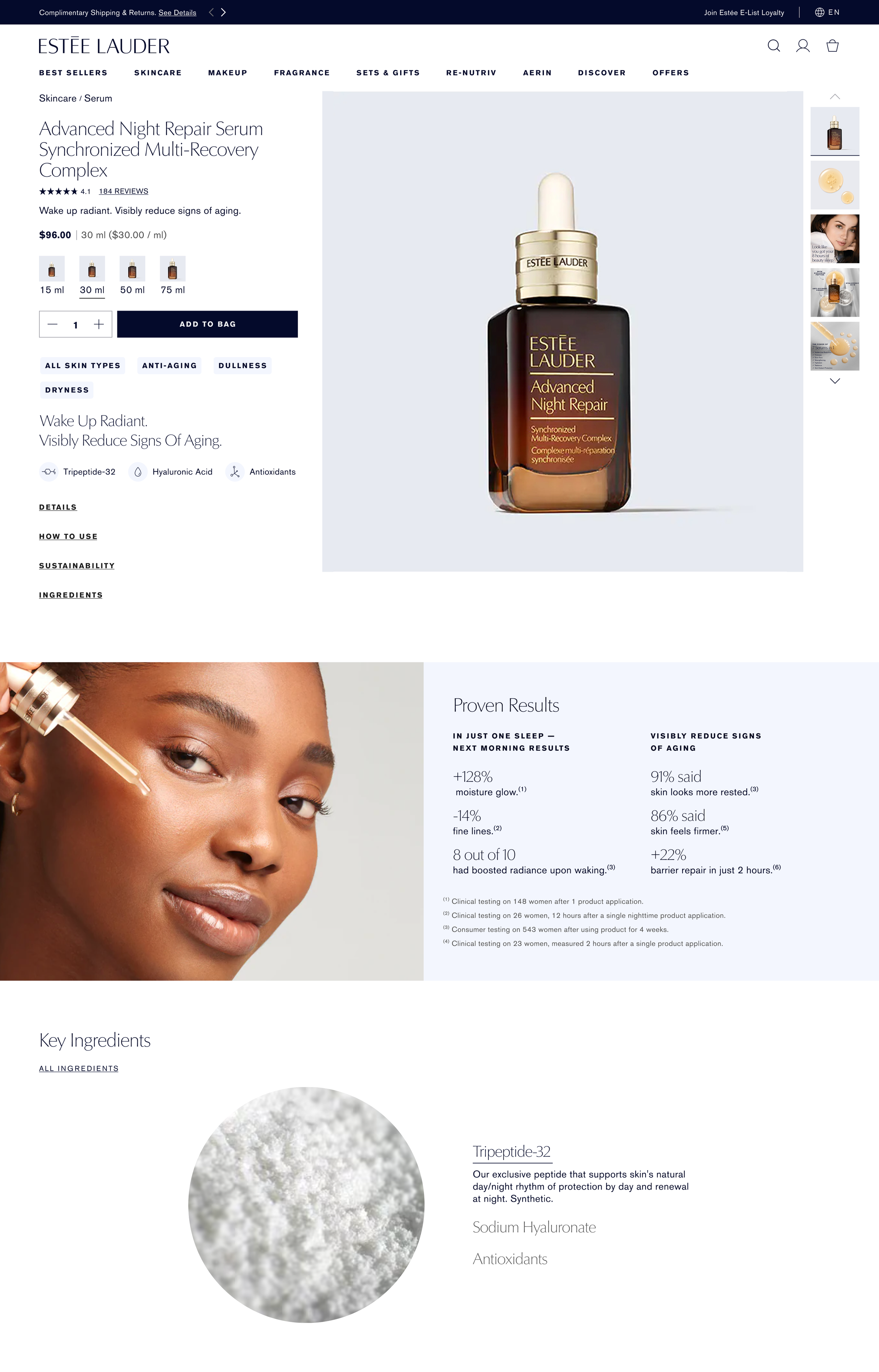
2-up grid layout vs. our traditional 1-up with thumbnail gallery to the right, allowing customers quicker view of all product images without having to click through them all.
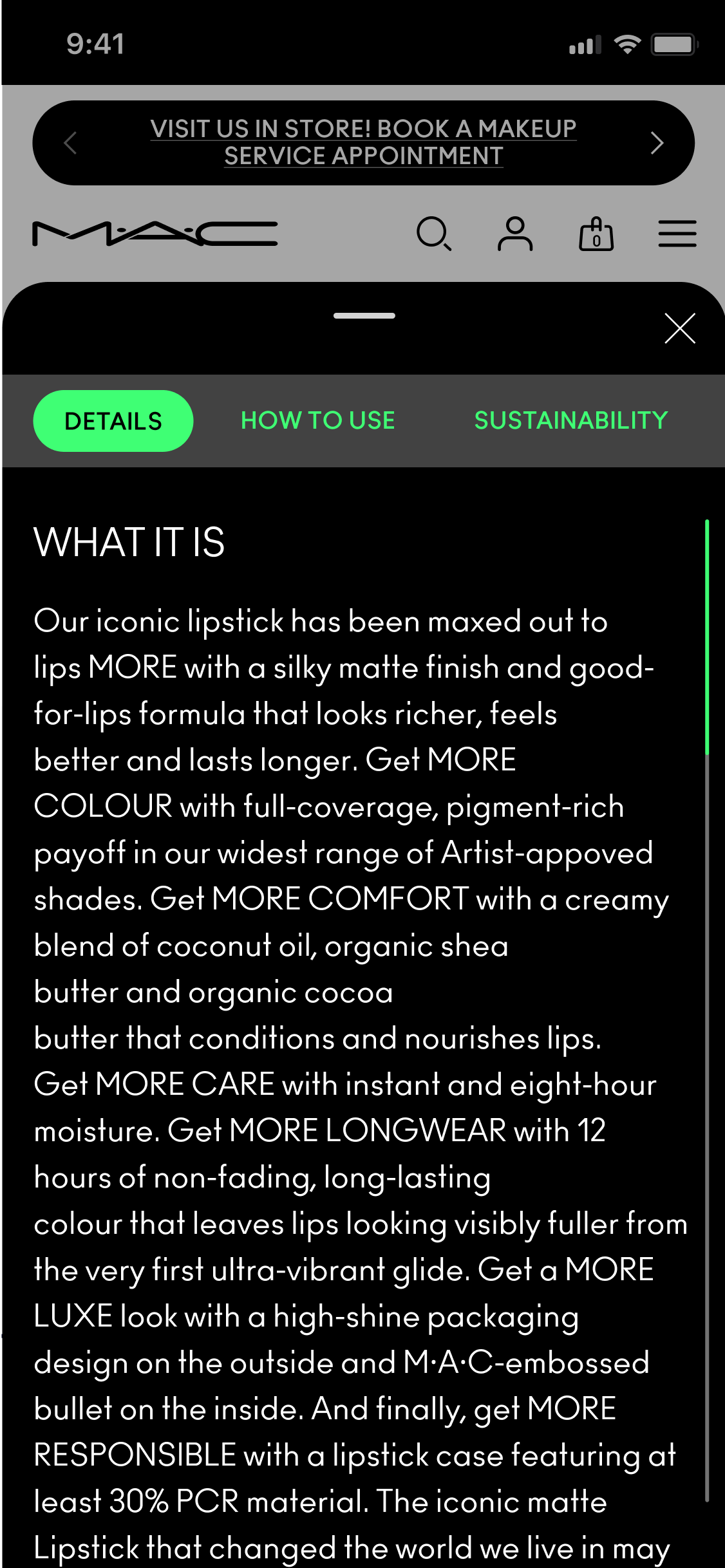
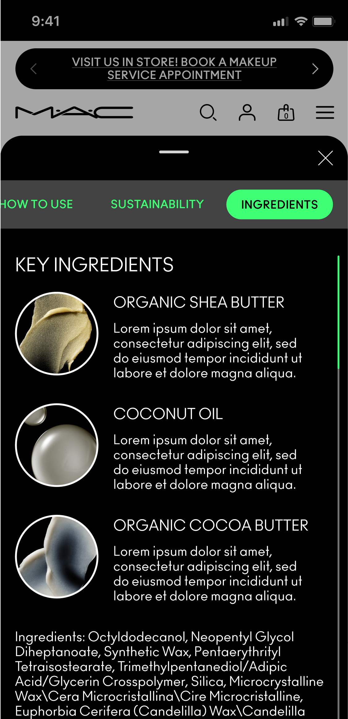
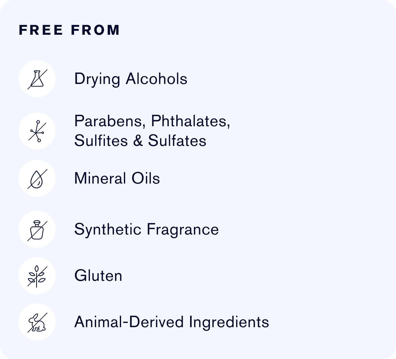
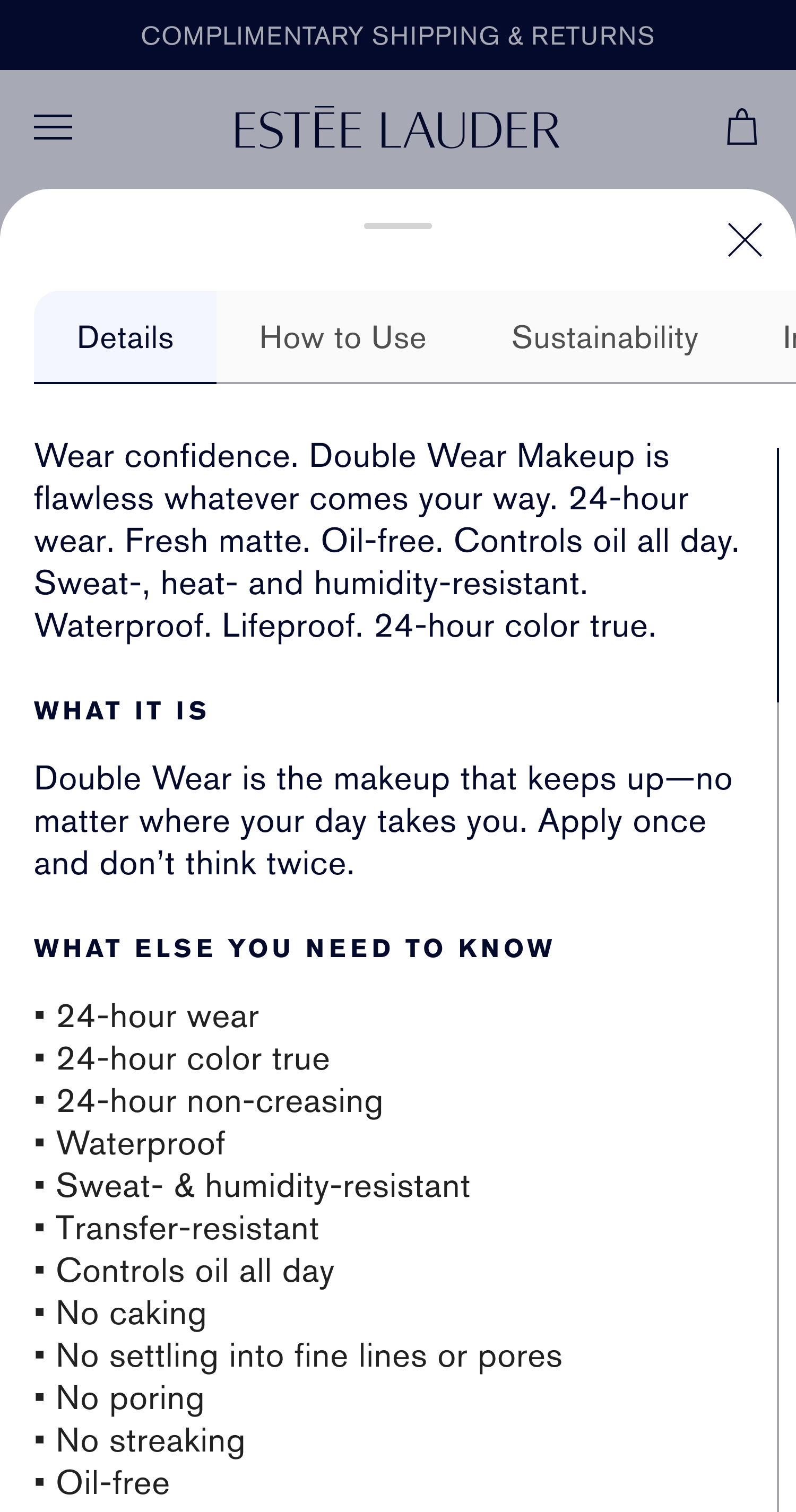
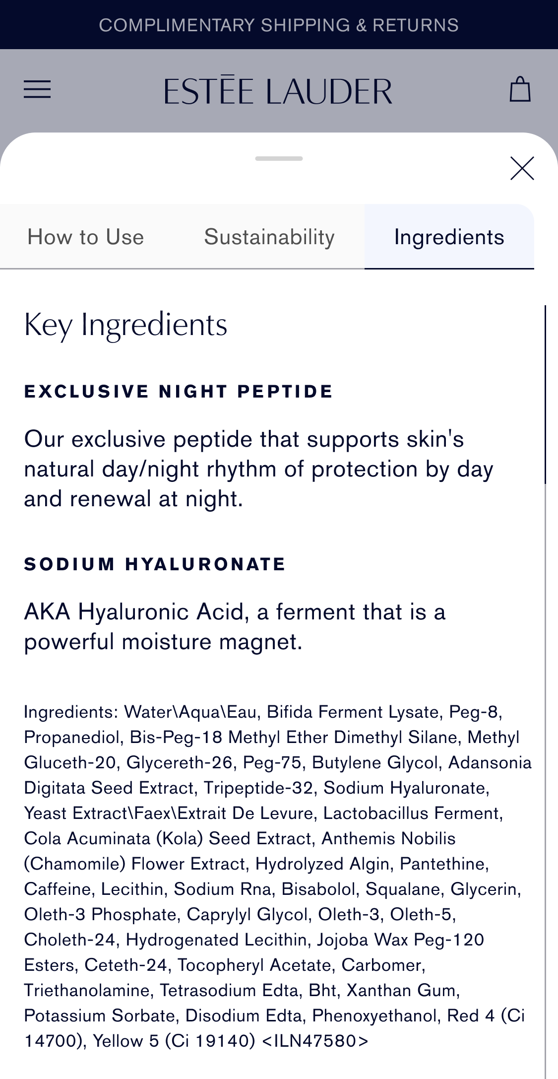
Use of overlays with links instead of traditional accordion (many ELC brands have extensive long copy in their description which creates awkward white space, so overlay is a great solution with ability to customize content for each brand).
Pulling out product benefit information through:
CVL Badges
Custom Iconography benefit highlights (for brands that do have design systems but lacked specific benefit iconography, as with EL and MAC, I created custom, on-brand icons for these concepts)
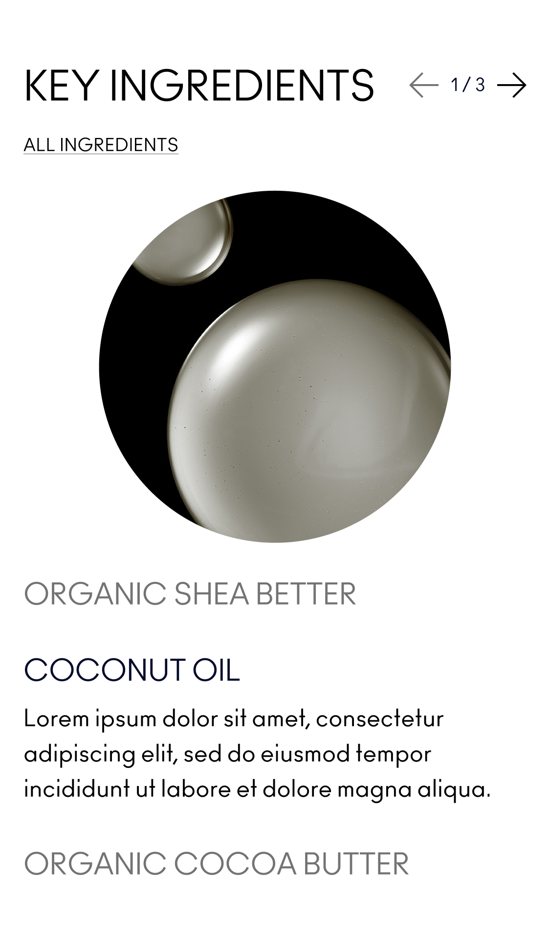
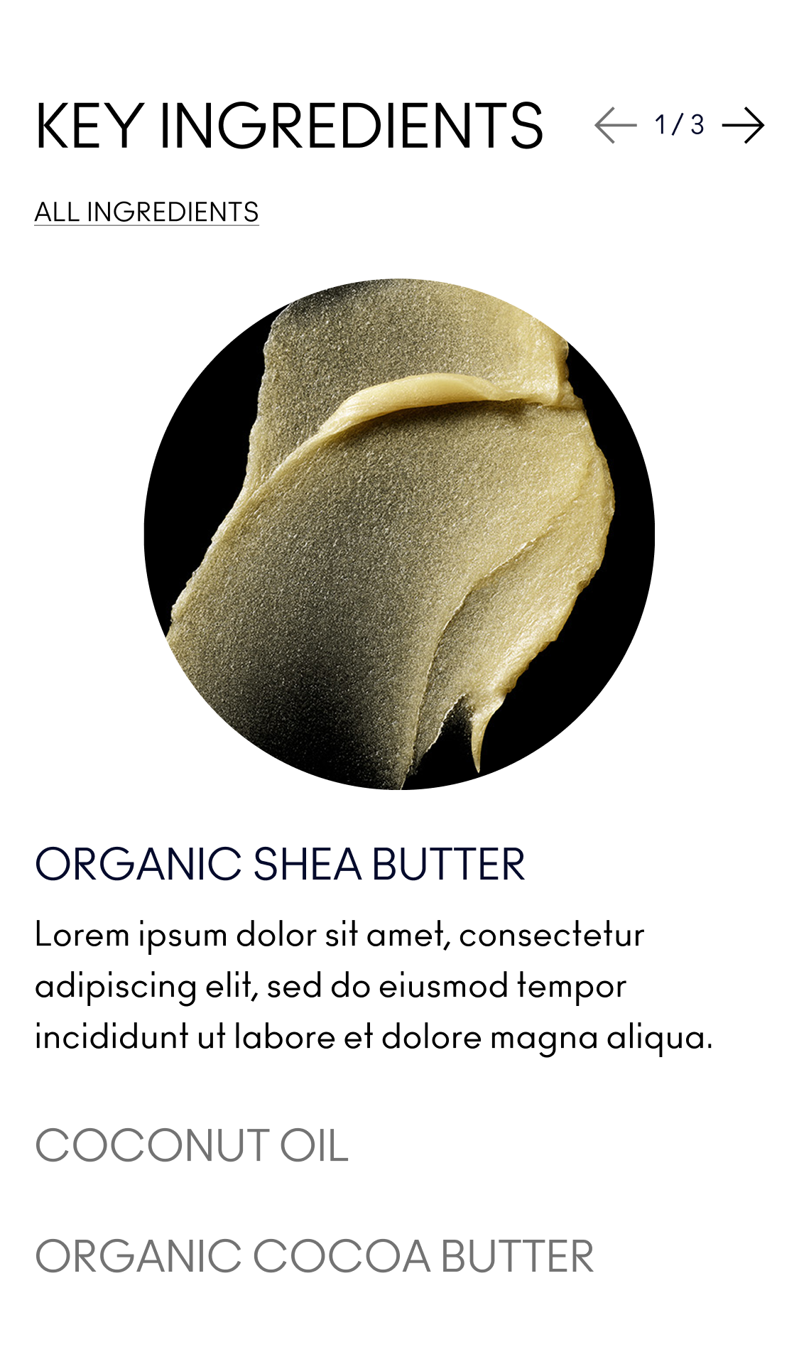
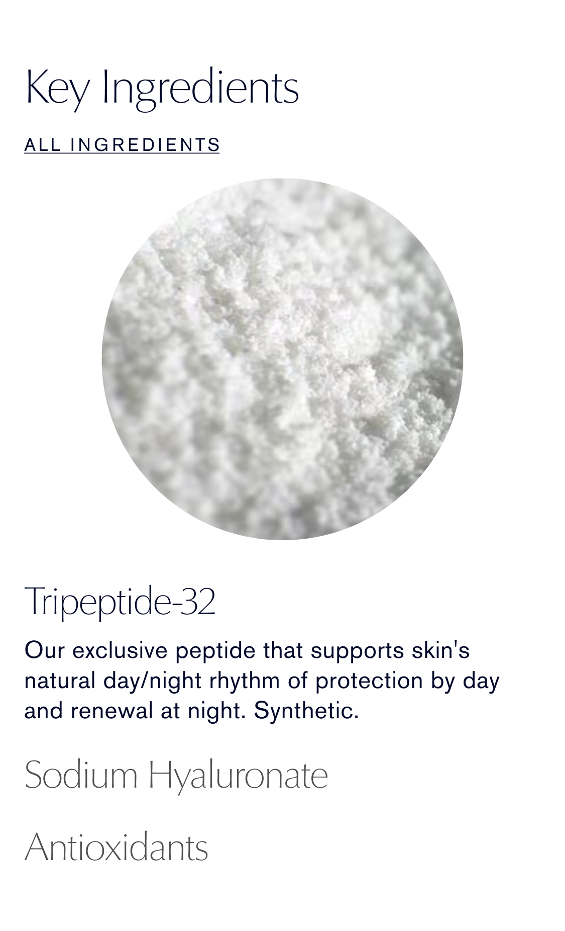
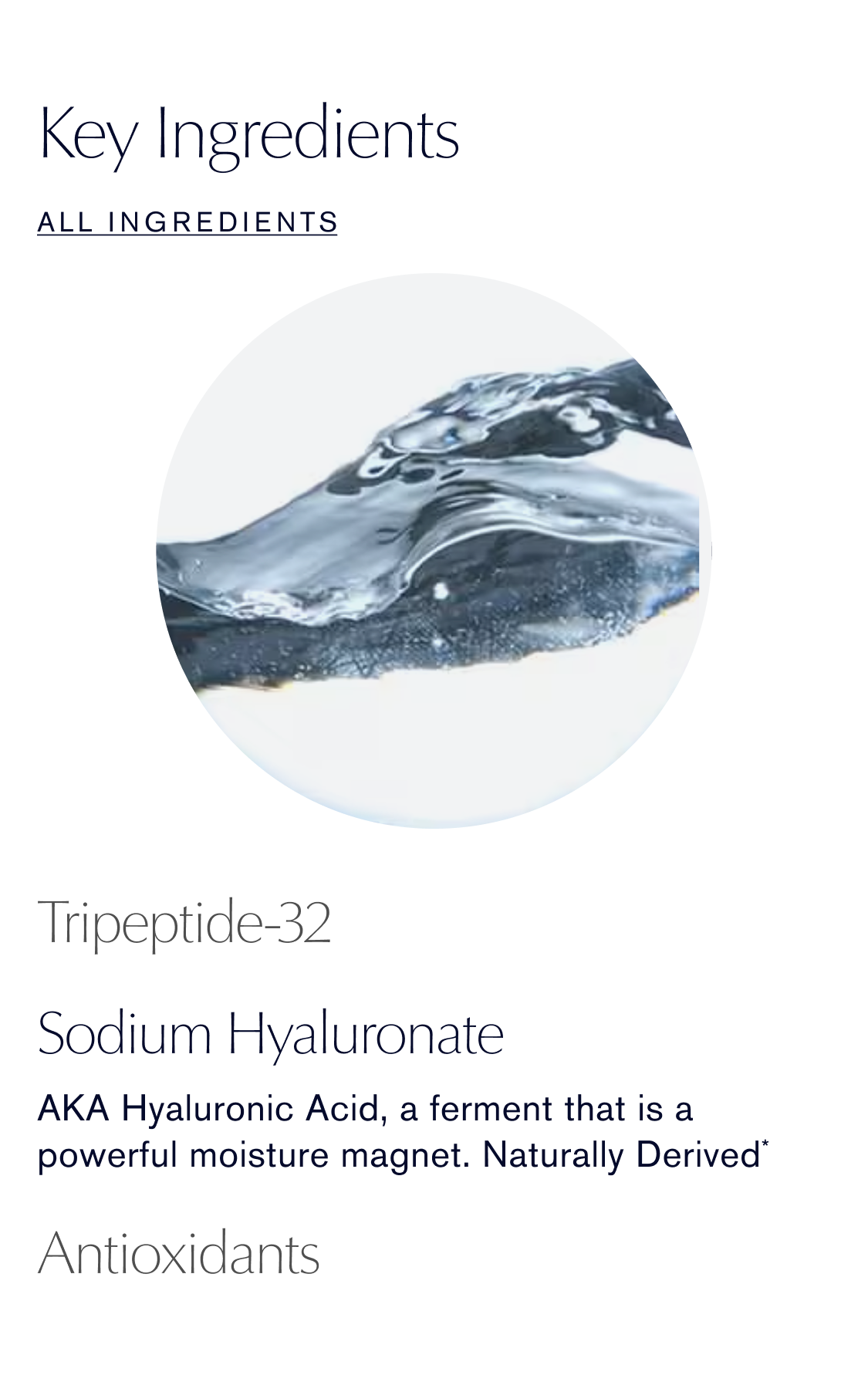
Content Blocks (Key Ingredients, Statistics)
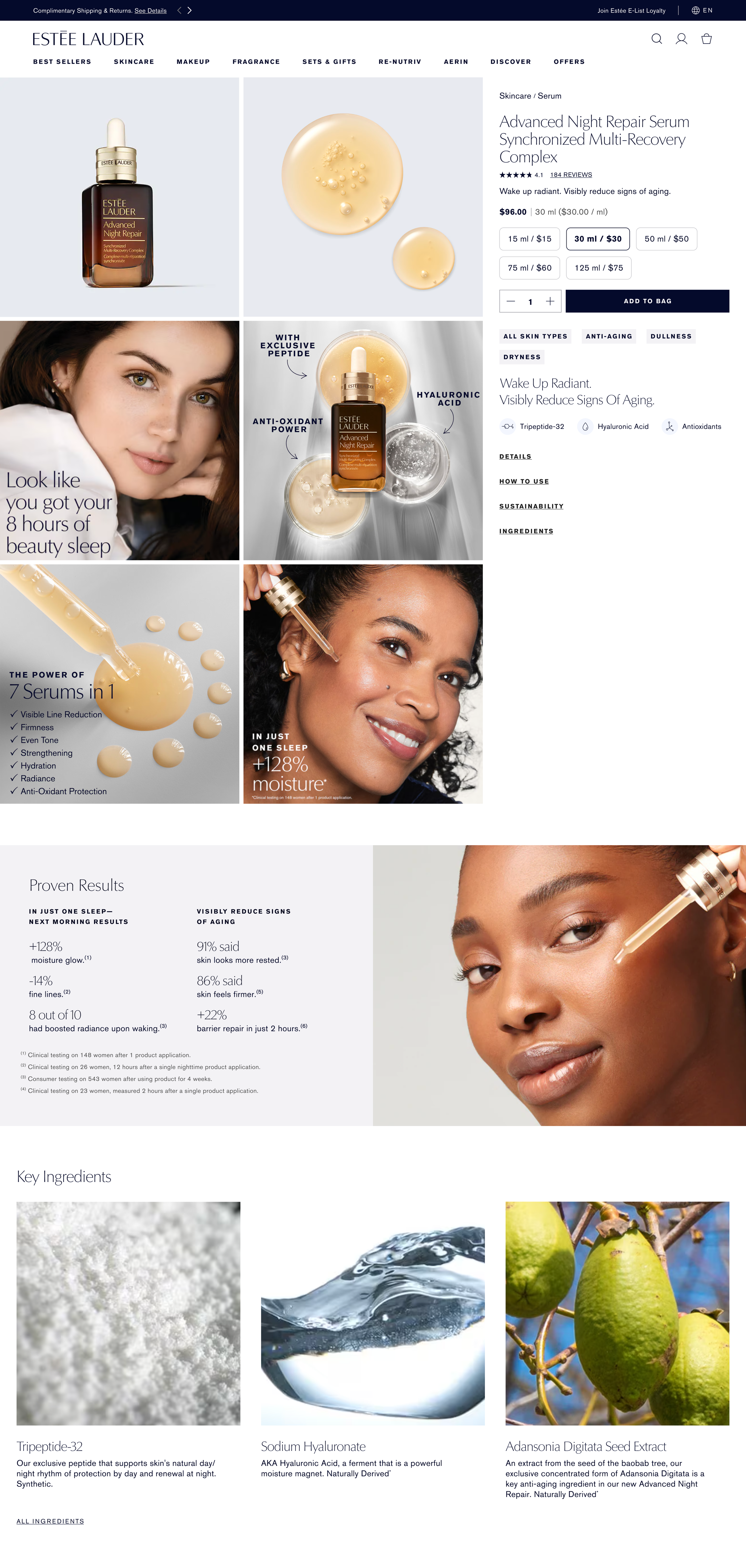


CONCEPT 2
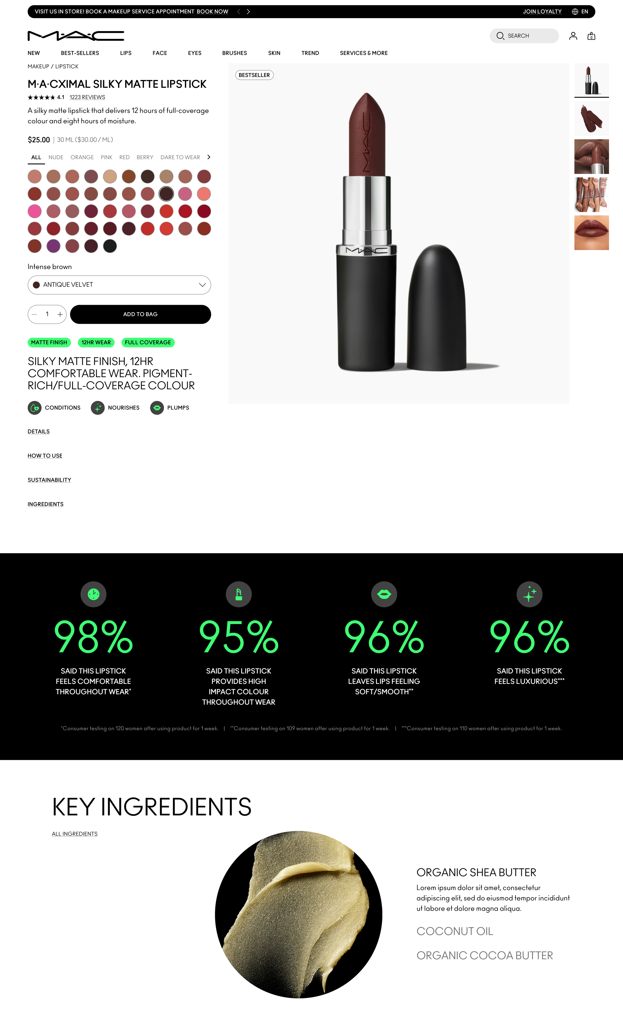
Same changes as above with a few differences:
Images on the right vs. our traditional images on the left, with image thumbnails
Size chips as images
Key Ingredients UX functionality automatically transitions as you scroll
MAC ITERATIONS
Showing how these concepts could work across brands, while having fun exploring UI treatments. Added custom iconography here as well that resonated with MAC’s existing Design System icons.